Thursday, July 17, 2008


Star Plots: Allows the comparison of multiple data units for each group. The variable frequencies for each group are plotted as radii from the center.

Correlation Matrix: Shows any correlation between any pairs of data sets.


Similarity Matrix: any group of data units plotted on the x and y planes with points marked where any two data units are similar.

Stem and Leaf Plot: The numbers in the column to the left of the bar are the stem and are added to the numbers in the columns to the right of the bar to complete the data.
Box Plot: boxplots can be used to display differences between populations without making any assumptions about the underlying statistical distribution.


Histogram: A graph that uses vertical or horizontal columns to display the frequency of some variable.


Parallel Coordinate Graph: Each variable is graphed on a vertical axis. A data element is plotted as a connected set of points, one on each axis. It can be used to explore relationships among variables.

Triangular Plot: Each side of an equalateral triangle is an x, y, or z plane on which three variables are plotted showing the interaction of the variables.


Windrose: A circular plot showing the frequencies of wind from each direction during a given time period.

Climograph: A graphic representation of the correlation between temperature and precipation during a given year.

Thursday, July 10, 2008


Population Profile: Also called a Population Pyramid, it may take the form of a graph composed of horizontal groups of bars showing the quantities or percentages of people of both sexes at each age group.

Scatter plot: A scattered group of points are plotted that show a relationship between two variables. Regression analysis can be used to show a trend line that is characteristic of the values plotted.

Index value Plot: The changing variables are plotted against an index value which may be any given variable during a given year or a zero value and the variables plotted plus or minus relative to that index value.

Accumulative line Graph or Lorenz Curve: A graph for showing the concentration of economic quantities such as wealth and income. It is formed by plotting the cumulative distribution of the amount of the variable concerned against the cumulative frequency distribution of the individuals possessing the amount.


Bilateral Graph: Two related variables that both use the same x and y planes are plotted on the same graph for comparison. It may also be a graph that shows increases of a variable on one side of a graph line and decreases on the other side.

Saturday, July 5, 2008


Nominal Area Chorlpleth Map: qualitative, categorical, classification into groups without any ordering.

Unstandardized Choropleth Map: The data used in making the map is just the total data and not areally averaged.

Standardized Choropleth Map: A choropleth map that has been areally averaged. The information is not just a total value (e.g. number of people in a state ) but standardized to some unit, usually area (e.g. people per square mile).

Univariate Choropleth Map: A choropleth map in which only one variable is illustrated.


Bivariate Choropleth Map: A choropleth map in which two variables are distinquished. In this case, Democrat and Republican.

Friday, July 4, 2008


Unclassed Choropleth Map: A choropleth map in which the data is continuous. There are as many intervals as there are areal units.


Classed Choropleth Map: The data is grouped within areas such as states and counties, shaded according to value. Areal units are combined into a smaller number of units classified as intervals. There are typically four to seven units of classification. Units may be classified according to equal steps, natural breaks, minimum variance, or quantile.

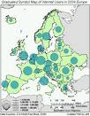
Range Graded Proportional Circle Map: Range graded proportional circle map: a proportional circle map that depicts the data in relation to ranges of data. The information is classified as equal quantiles, breaks, natural breaks, and minimum variance. . Range-graded scaling: The data are divided into groups, using classification procedures common to choropleth mapping. The design goal is for symbol size discrimination, rather than magnitude estimation. The cartographer chooses symbol sizes for adjacent classes so that the map reader can easily distinguish between circle sizes, and therefore, categories. Only a set number of circle sizes are used.